01. Sound Placement
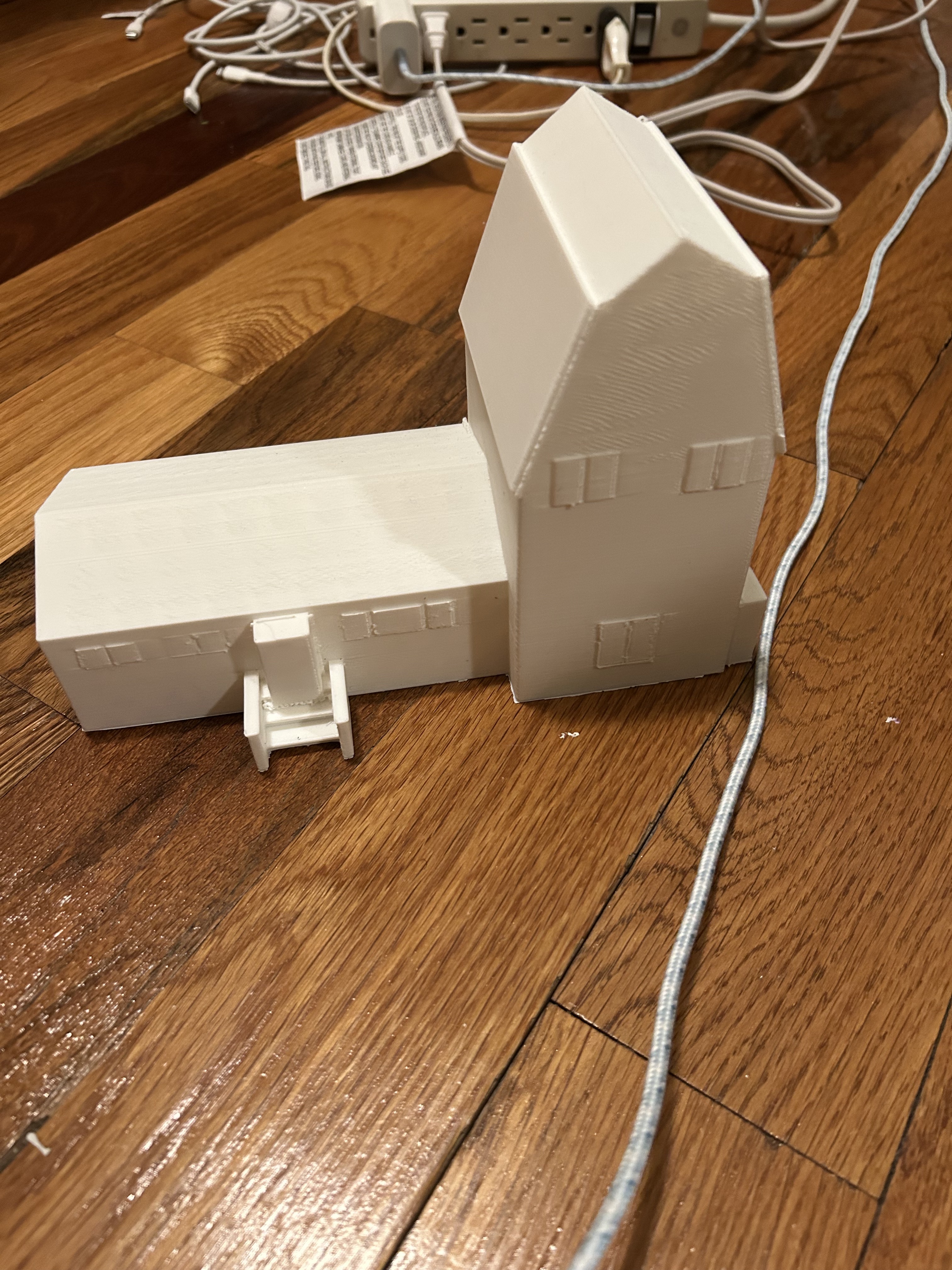
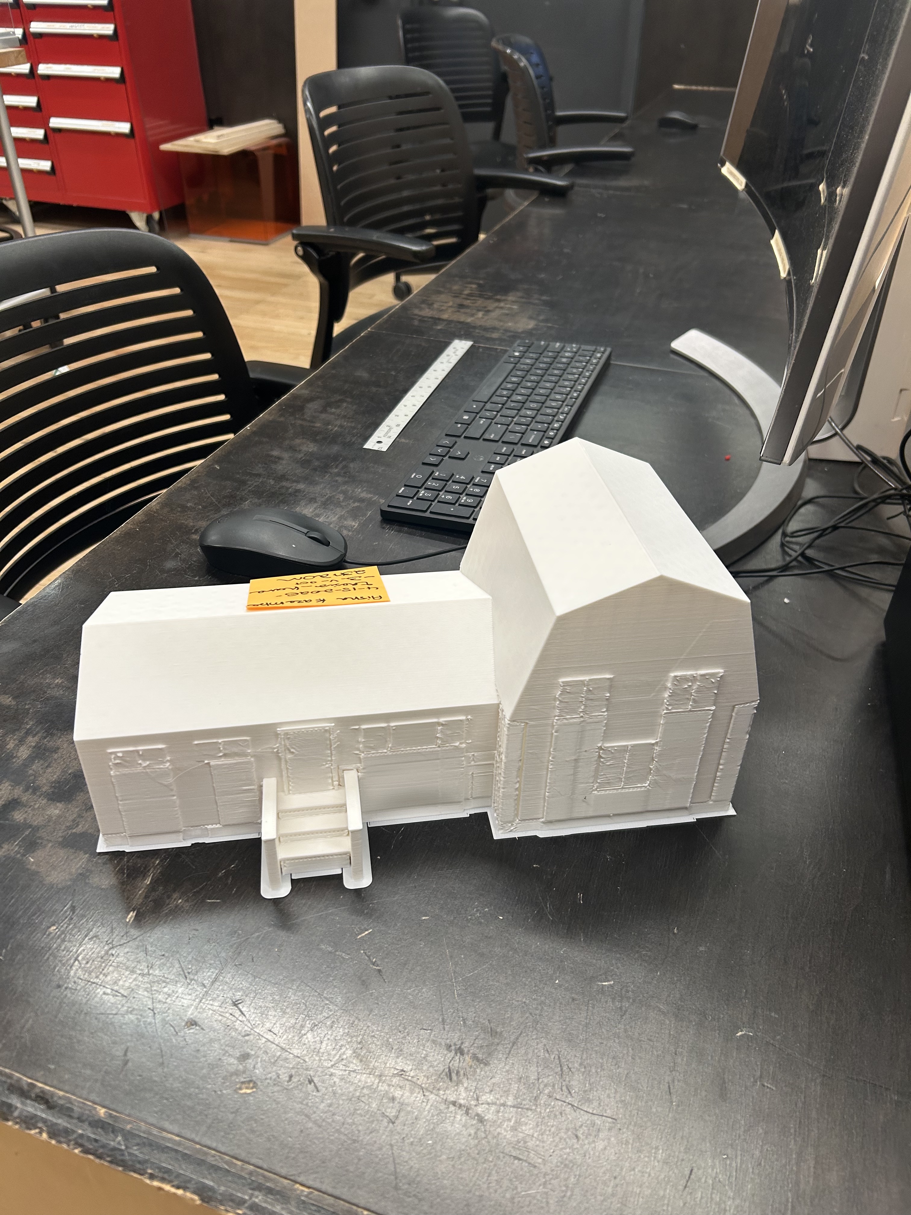
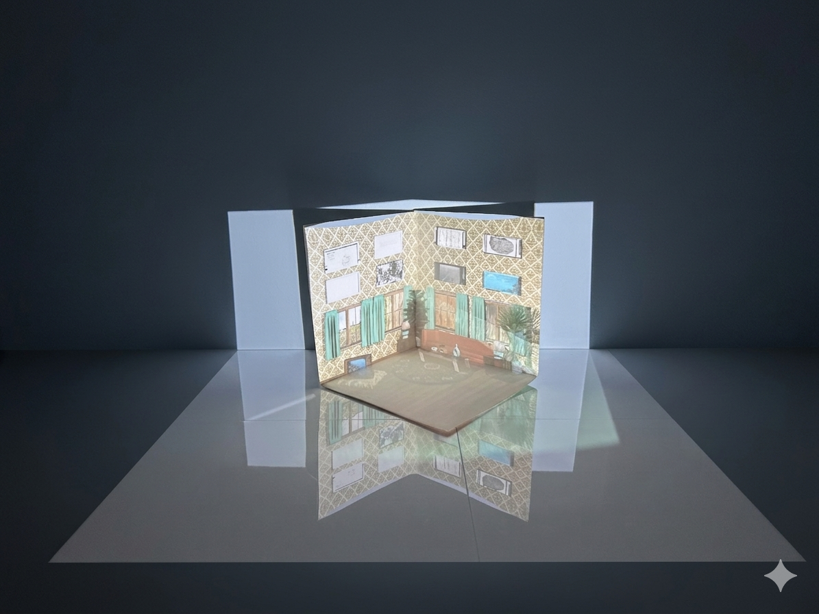
The installation is built around a 3D-printed house with a projector casting historical imagery onto its surface, extending the illusion of a sidewalk into the viewer's physical space so the boundary between the model and the room dissolves.
Problem: The sound component (recordings of someone moving through a house, doing ordinary things) wasn't creating the right sense of presence. Placed in front of the house, it felt external, like an announcement rather than a world.
Process: Tested the full installation during a structured presentation demo and gathered feedback on how the audio felt in relation to the projection.
Decision: Moved the speaker behind the house so the sound appears to come from within. The recordings feel like evidence of life inside, reinforcing the projection instead of competing with it.
02. 3D-Printed House: Scale
Problem: The first print was too small. At that scale the projection lost detail and the model read as a toy rather than a home.
Process: Tested projection quality on the small model. The surface area wasn't large enough for the projector to render texture or detail legibly.
Decision: Reprinted at a larger scale. The increased surface area made the projection sharp and the model convincing in the space.
03. Room Projection Surface: Materials
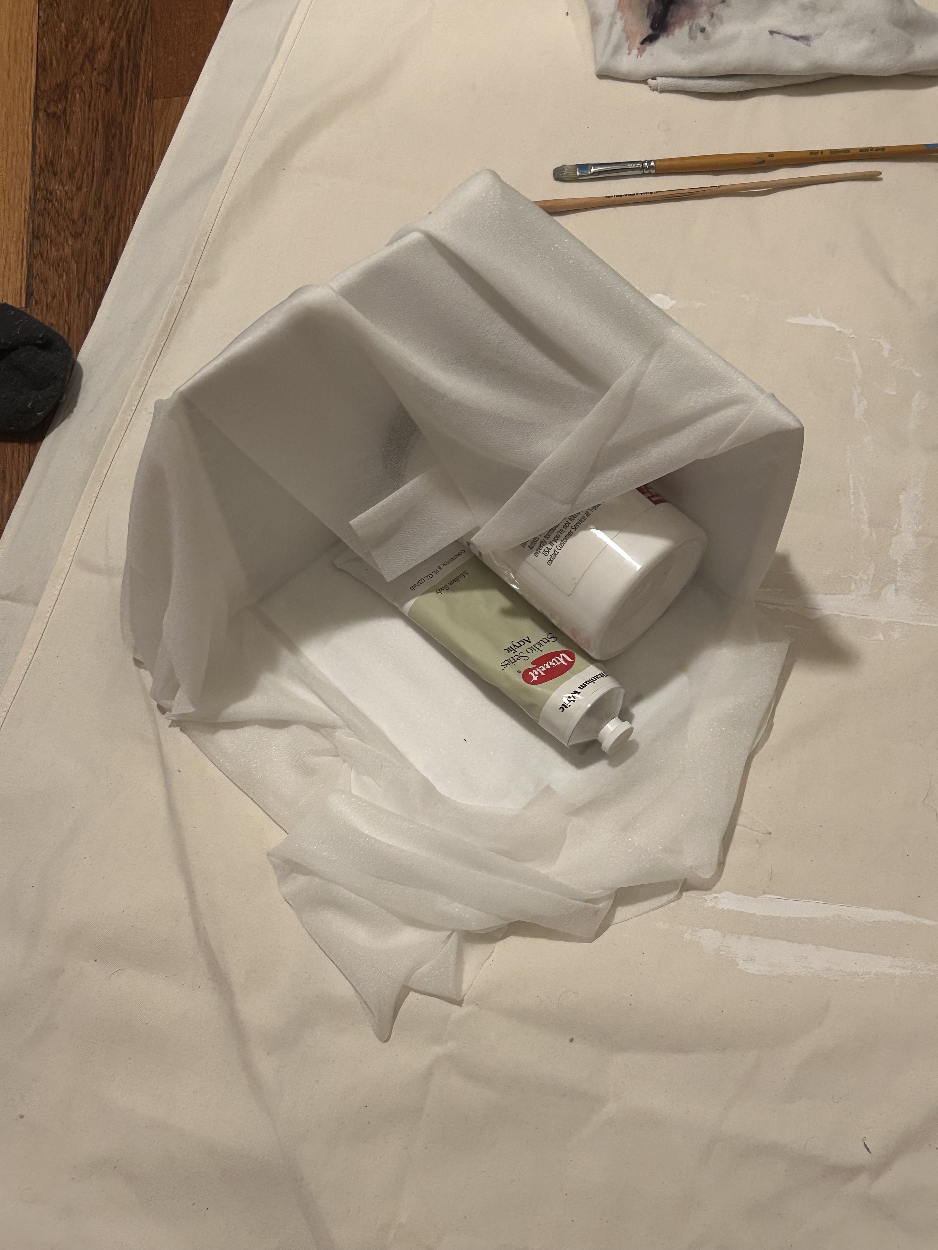
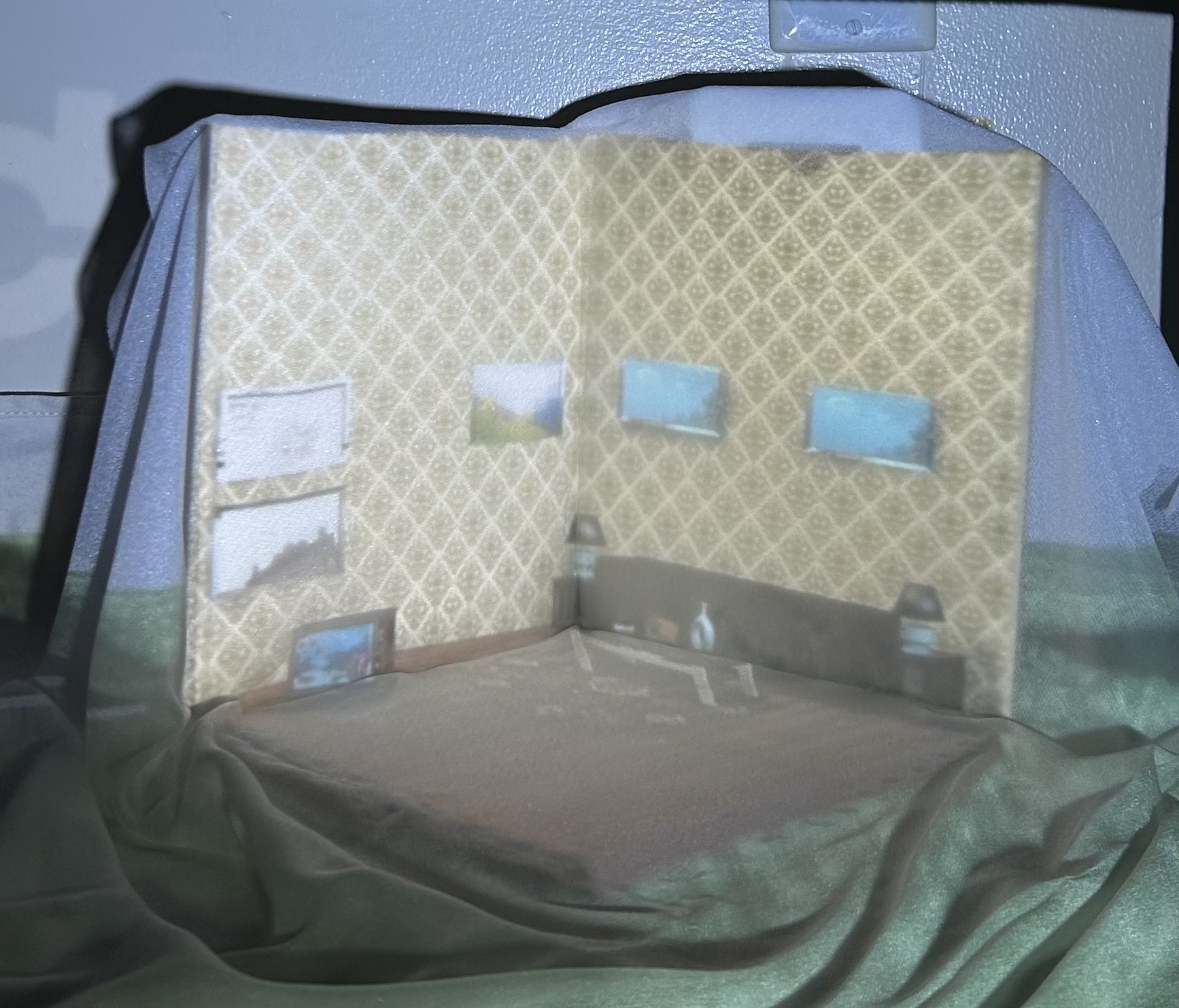
Problem: The projection needed a surface that could hold image quality, look intentional in the space, and be portable.
Process: Tried fabric over cardboard. The fabric diffused the projection and washed out the image.
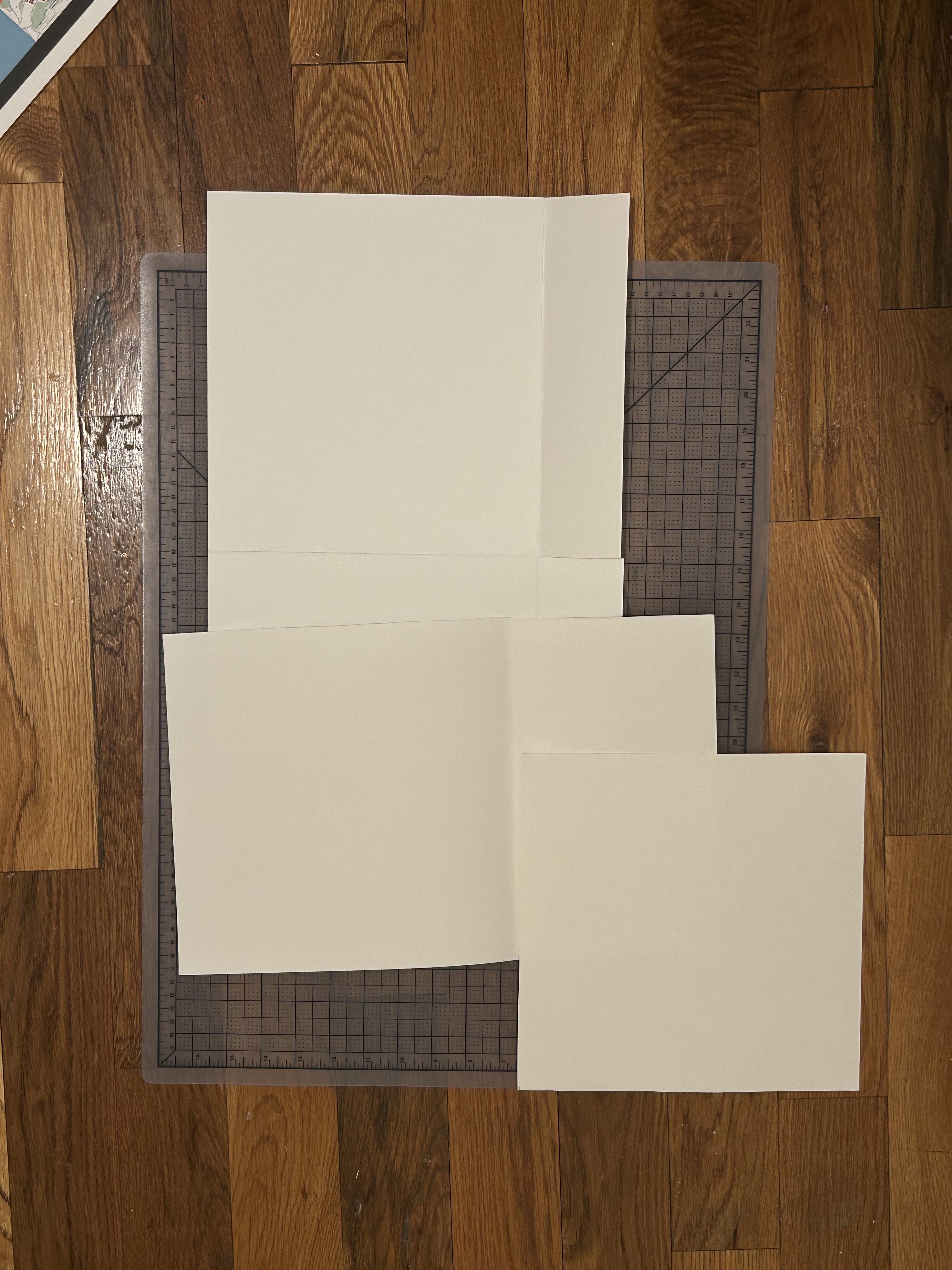
Decision: Switched to canvas paper folded into an origami-style structure. Held projection quality, cleaner look, light enough to transport.
04. Digital Interface: Platform Pivot
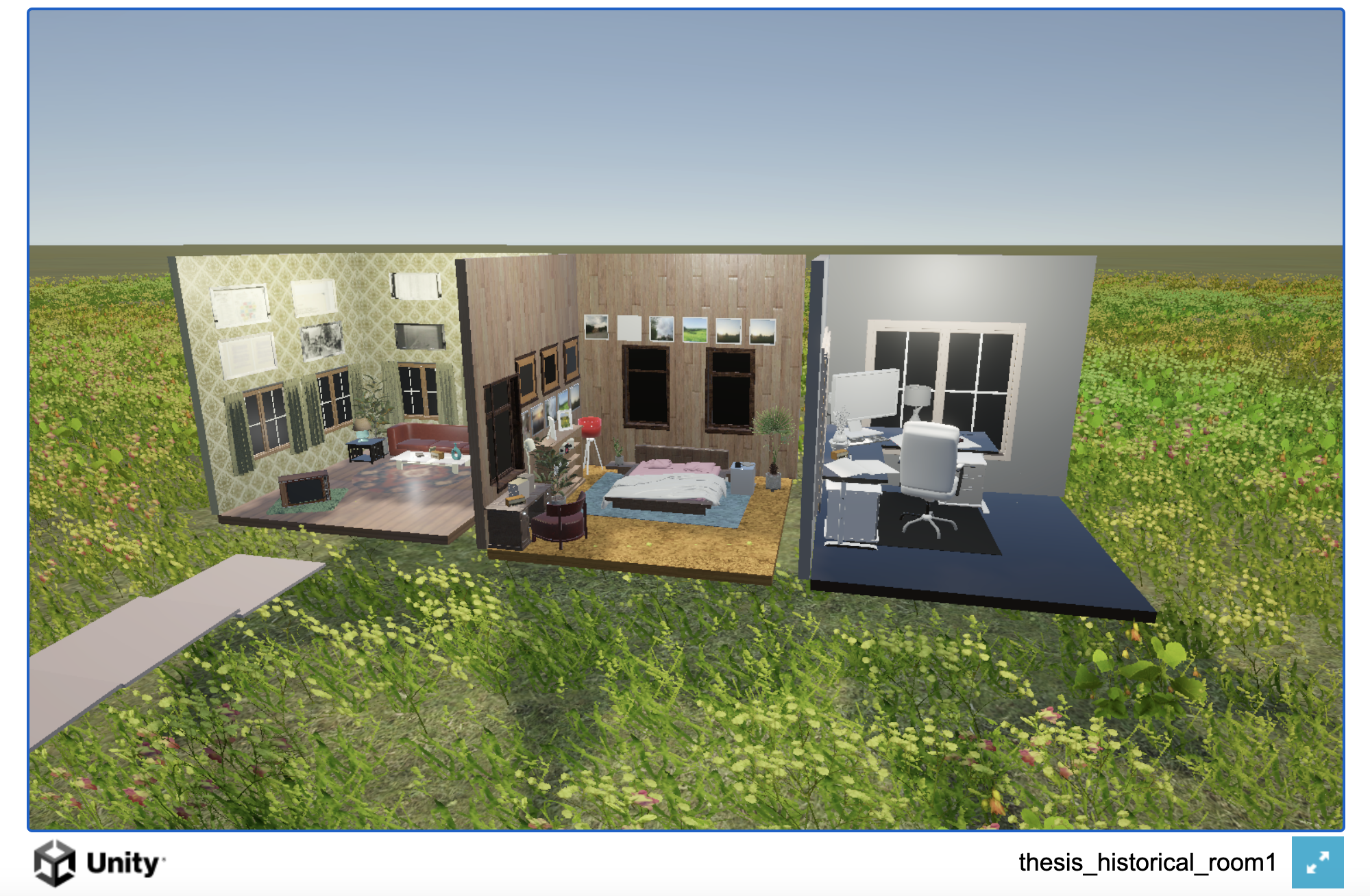
Problem: The digital component needed to be accessible via QR on a phone. Personal testing showed the Unity build wouldn't load on mobile. User testing confirmed it and surfaced a second problem: users felt the digital experience felt too visually disconnected from the physical installation.
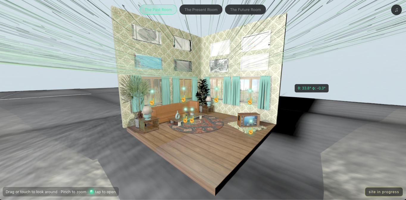
Decision: Rebuilt in Three.js using spherical renders from Cinema4D, made from the same 3D model as the physical installation. Mobile load time dropped and the site works on any device via QR. See the original Unity build here.
05. Navigation: Onboarding
Problem: The first version dropped users directly into the 360 environment with no onboarding. Users had to experiment to find navigation, spending time on the interface instead of the content.
Decision: Added a landing page that frames the project before users enter. Added a table of contents and a small disclaimer pointing out that media items are clickable. Reduced friction, increased content engagement.
06. Navigation: Click Interaction
Problem: Media items marked with dots. User feedback was consistent: people wanted to know what an item was before committing. Many didn't click.
Decision: First click reveals the item label (with a prompt to click again). Second click opens the media. Provides a preview before committing, and two redundant tap targets for forgiving interaction on both desktop and mobile.